This is Pamela Anderson, probably fresh from Canada and looking absolutely gorgeous. If what I read what was printed in her Playboy write-up right, she was only 18 years old when she posed for that august publication (February 1990).
Now there’s one thing I just don’t get. Take a look at this pic and compare with her recent photos. I could barely recognise the younger Pamela Anderson. Discounting the obvious age gap, I see absolutely nothing wrong with her body. She has a great figure, nice boobs, and an attractive face. Why she would want to go for surgical “enhancements” is quite beyond me. I felt she looked a lot worse after those procedures. Ugh.
Oh well, at least now we get to see Ms Anderson “in her prime”, so to speak. And she looked damned good!
This scan is released under my dScans WWSA series. As usual, you can grab the full-sized scan here. Now, this scan contains nudity, so those who are of a more delicate constitution consider yourselves duly warned.
Thursday, November 19, 2009
Sunday, November 15, 2009
For most folks, this lovely lady should be a familiar sight. She’s the featured model for a “bust enhancing” company in ads that run almost everyday in the free Today newspaper. Those full page ads are kinda hard to miss (for guys anyway).
She’s named Yako Rata (occasionally spelled Yaku Rata), an “international Japanese model”. She must also keep a fairly low profile, because my Internet searches on her pretty much turned up zilch. Or maybe she has an exclusive contract with this company :) Anyway, it’s good that they are not simply recycling the same few pictures in all the ads that featured her. The recent ones have her in a different hairstyle – I liked her much better with her hair down.
I think she’s hot, and she caught my eye the first time I saw her ad. Those dangerously low-cut dresses that she always wore in the ads most definitely helped . They more than highlight her bountiful assets :)
She’s definitely does not have that cutesy innocent look that seemed to be stereotypical of Japanese models. She has that kind of mature, smoldering sensuality that reminded me of Monica Belluci (now, THAT is a woman!).
Unfortunately, her ads do not seem to appear in any print media other than newspapers. So I had to make do with this full-page newspaper ad. And because of the low quality of the source material, I had to do a fair bit of work on it. If you guys know of any higher quality source, please do drop me a line :)
This scan of Yako Rata is released under my dScans WWSA series. As usual, you can grab the full-sized image here:
Saturday, November 14, 2009
Her name is Xiao. That’s it. Short and sweet. And I think she’s pretty hot looking, though I’m not too sure about that slightly pouty look she has in all her shots.
Xiao also did a photoshoot for Newman magazine a few years ago with where she posed in her birthday suit with only a painted swimsuit covering her important lady bits. Now that was a smoking hot photoshoot. It certainly was different. I’ll have to get that scanned sometime.
I released 2 scans of Xiao for my dScans WWSA series. They are both double page spreads, so I had to join them up in Photoshop.
For the longest time, I was afraid to retouch double page scans. The trick, of course, was to merge the image seamlessly, or you’ll end up with an ugly line running through the middle of the scan. You also have to cut the pages out of the magazine. That usually involves splitting open the spine of the magazine and pretty much destroying the magazine in the process. And more often than not, you’ll still end up with missing bits, so that the 2 pages don’t exactly line up. That’s where the fun begins…you’ll have to do tons of cloning to “fill-in” those missing bits. Sigh, why can’t they just print it in landscape in the magazine and be done with it?
As usual, grab the full sized scans here:
Thursday, November 5, 2009
Laurie Carr
I scanned this picture of the gorgeous Laurie Carr from a Playboy magazine about 10 years ago. Not too sure if I’ve ever released it, but I remembered that the scan was pretty small.
This was mainly due to 2 reasons:
Firstly, the abysmal quality of the print. Now, I’ve scanned plenty of images from magazines in my time, and I reckon that American magazines have just about the worst print quality. Tissue paper thin pages and half-tone patterns the size of golf balls, it takes A LOT of work to make the images look halfway decent. Playboy is by no means the worst offender, but they’re up there. Anyway, one of the tricks to improve quality is to down-sample your image, i.e. make your image smaller. If you scrunch your image small enough, even the lousiest retouch can look good. It’s sorta like how a low bit-rate movie file can look pretty good on your portable PMP but looks like crap on your PC monitor. :)
Secondly, big monitors were a rarity back then. After all, it made no sense of scan something larger than what your monitor can display, right?
And there’s another reason I didn’t mention….my skillz weren’t very good then, so that was the best I could do. Larger images really highlight any deficiencies in your retouching, and can be distracting (in a bad way).
Anyway, I hope that I’ve improved some since then. :)
This scan of Laurie Carr is released under my dScans WWSA series. And yeah, it contains tasteful nudity. So for those of you who are offended by this kind of stuff, consider yourself duly warned.
Grab the scan here.
Saturday, September 5, 2009
Stacy Yang
I got this hand-me-down issue of Torque magazine from a buddy recently. For those unfamiliar with the magazine, Torque deals with everything that is even remotely automotive related. I’m not a car fan, so this magazine usually goes under my radar. What I do like, though, is that there is usually a scantily clad cutie that accompanies the cover story. And those ladies are usually pretty hot looking, too. Pretty girls and expensive cars seem to go hand in hand. They sure know what guys like, heh.
This kinda made me wonder why the local editions of Maxim (now defunct) and FHM do not plump Torque’s sources. The girls are hot and seemed to be local models, judging from the write up inside.
All the pictures inside were 2 page spreads, and all of them have way too much text crowding the image. I had to do a whole lot of cloning to hide the seams and get rid of the text. The one saving grace was that the print was of fairly high quality, even though the paper was kinda thin. Other than text and seam removal, it was a pretty simple retouch. I left the background plain to make the subject matter stand out. Compared to American magazines, local magazines are a cinch to retouch. The half-tone pattern used in American printing are the size of golf balls! They need a LOT of retouching to make them look half-way decent.
Although I named the scan Stacy Yang, it’s by no means certain that this was actually her name. The model was, unfortunately, uncredited in the photo-shoot. They seemed more interested in mentioning the sponsors of her clothing, the photographer and the make-up artist than the model name. Shucks. I got the name from a one-line blurb in the article. What the hell, I’ll just use the name Stacy Yang rather than leave her anonymous. If anybody knows her name, do feel free to drop me a line :)
I have released 3 scans of Stacy and that what’s-its-name car for my dScans WWSA series. As usual, you can grab the full sized scans here.
Monday, August 31, 2009
Maggie Tan - Maxim Singapore, August 2007
Introducing Maggie Tan – model, actress and all round hottie.
Some of you guys may recognise her – she was the girl holding briefcase No. 4 in the local version of the US TV Game Show, Deal Or No Deal (Season 1). I don’t usually watch TV Game Shows, but perhaps I should, especially if they feature girls like her :) Click the wiki link to find out more.
This scan is from the August 2007 issue of Maxim Singapore. Maggie was also the cover girl. It was a smoking hot cover btw, and that was what attracted me to buy that particular issue. Sadly, Maxim Singapore is no more. It closed just as it was finding its footing.
I have released 2 scans of Maggie Tan from the Maxim photoshoot to my dScans WWSA series. There were more pictures in the magazine, but I felt these 2 were the best ones. Check out the bikini scan that I posted here: that’s an awesome lookin’ body and oh that sexy belly button! Smokin’ baby! Maggie has a longish face, and she should really smile more – it really makes her face light up. Not that I’m complaining about this come-hither look shown in the pics. LOL
Tuesday, August 11, 2009
Rachel Nichols - Maxim June 2001
Well, I just watched the GI Joe movie. I enjoyed it. Checked all the right boxes for a blockbuster summer movie. Big explosions, spiffy special effects, great fight scenes, a truly awesome car chase sequence, nasty villains, beautiful women and of course, square jawed heroes. Oh yeah, a way over-the-top plot to tie everything together. All black and white, good vs evil. No ambiguity here! And the good guys won (sorta). You do know a sequel will be coming along, right? :)
For a supposedly kiddie movie, the body count was surprisingly high - the bad guys seemed to have no compunction killing people, collateral damage be damned! And some are pretty graphic, like the part where the pretty blond female soldier got skewered right in front of her CO by the baddie from behind. But hey, it's all good if you don't see any blood right? :)
I know some reviewers are totally savaging the movie, but I liked it. It was more satisfying to me than the 2 hour snoozefest that was the latest Harry Potter movie (which the reviewers seemed to like). But hey, I'm not a movie reviewer, so what do I know? :)
The 2 leading ladies looked very good indeed. And talk about misleading advertising...Rachel Nichols only appeared in that black skin tight combat suit for only a couple of seconds near the end of the movie - shucks.
As promised, here are the Rachel Nichols scans. I've released 4 for my dScans WWSA series. Hope you like them! As usual, grab the full sized scans from either my Yahoo Groups or Google Groups.
Sunday, August 9, 2009
Rachel Nichols - Maxim June 2001
Well, the blast from the past continues. This time we have Rachel Nichols, circa 2001. Rachel, as you may know, is currently starring in the latest action movie, GI Joe - The Rise of Cobra. I believe she's playing the character, Lady Scarlett.
This Maxim photoshoot has her posing in a camo swimsuit in the middle of some jungle. And now, 8 years later, she's acting in a GI Joe movie. Coincidence? :)
Anyway, I'll be catching the movie later tonight. I wonder if she's aged well....
I will be releasing the Rachel Nichols scans under my dScans WWSA series. Watch for it soon!
Thursday, August 6, 2009
Felicia Chin
I have just released 2 scans of Felicia Chin. As usual, you can get the full-sized scans via my Yahoo Groups & Google Groups.
So the latest foray into long forgotten corners of my room continues. My room was being repainted, and it was an opportunity to clear through the mounds of stuff that clutter the floor. I unearthed plenty of old magazines. One of which featured Felicia Chin, circa 2005.
I think it's interesting to see the steady progression from her first underwhelming FHM shoot to the current cutie we see today. I don't normally scan "backwards" chronologically speaking, so it's kind of a reverse time warp, or something. Speaking of which, I SHOULD still have that FHM issue around somewhere, but I still haven't found it yet.
This particular scan was from a 2 page magazine spread. I felt that the plain white background was kinda boring, so I decided to draw some patterns using some of the more exotic brushes in Photoshop CS2.This particular brush gives a leaf pattern, and the size varies with the pressure you put on your stylus. The harder you press down, the bigger the pattern. I doodled on the background with a variety of colours, and I think it makes a nice accent.
Monday, June 29, 2009
Stacy Keibler - Maxim March 2006
I was cleaning out my cupboard out just the other day when I came across this copy of Maxim, featuring the delectable Stacy Keibler. I had forgotten that I purchased the magazine, and so it has languished in that dusty corner for almost 3 years. Oh well, as they say, better late than never, right?
And speaking of Stacy, can you believe that she was once a professional female wrestler? Me neither. I always have the impression that female wrestlers are usually built like the feminine version of the Incredible Hulk, all bulk and muscles in the wrong places and not enough curves in the right places. But not Stacy, oh no. First off, she's so sweet and feminine looking, and her lithe, toned body provided the eye candy and the sex appeal. And did I mention her incredible legs? Hand over heart, Stacy has the finest pair of legs that ever graced the female form. And those high stiletto boots she wore in this photo-shoot showed them off to great effect.
I have released 5 scans from this set for my dScans WWSA series via my Yahoo & Google Groups. It was a fairly easy retouch - they were all full page photos with very little text in the way.
I enjoyed doing this series of scans, and I hope you like them :)
Tuesday, June 23, 2009
I just released this scan of Ayumi Hamasaki for my dScans WWSA series. As usual, you can grab it from my Yahoo or Google Scan Groups.
JPop Megastar Ayumi Hamasaki is the new face for the Japanese lingerie company Wacoal. The tag line is "Trust Me". I have no idea what that means, but that's marketing speak for ya.
2 things immediately catch my attention whenever I see any pictures of Ayumi - those almost freakishly large, anime type eyes, Now 2 other things have my attention whenever I see her Wacoal ads. I never thought Ayumi was so, um, well endowed ;)
I always thought Ayumi was a very petite girl, having a typical build of most Asian girls. Well, obviously I was mistaken. That, or that's one awesome push-up bra from Wacoal!
Well, this was the ad I was talking about. Ripped it off from the Wacoal site. I'm still trying to find a magazine ad so I can scan it. I think she looks absolutely smashing in this photo. Very feminine and sexy.
Saturday, May 23, 2009
I just released this scan of Jaymee via Google Groups and Yahoo Groups.
I had actually scanned this quite some time ago. It's actually from her Maxim photoshoot. Unfortunately I had a heck of a time trying to make the rest of the scans look good. Something about the printing and the paper I suppose.
I usually try to release the scans together if they're part of a similar series, but since it's taking too long to wrestle with the rest of the scans.....what the hell :)
Thursday, May 21, 2009
Korea Vacation
Well, I had a nice relaxing vacation in Korea. Beautiful country, gorgeous women, great food. I positively gorged myself on Kimchi. Heh, looks like I developed a taste for it.
I had a great time there. Unfortunately, I couldn't find any Korea Maxim or FHM available for sale. Pretty darned strange, I was positive they have them for sale because I had seen cover scans of Korean FHM and Maxim. Pity. It would be nice to scan some Korean women :)
Still sorting through my photos, but here's a sampling...
More photos at my Flickr album:
Thursday, April 9, 2009
Mind Your Body - Interview with Jaymee Ong
There's an interview with Jaymee Ong in today's Straits Times supplement "Mind Your Body".
A fun read for all Jaymee fans, though I'm too sure of her hairstyle in the featured photo. Kinda makes her look like a female Vulcan or something lol.
This would be my last blog posting for a while....I'll be leaving for a week's vacation later this evening. See ya all in a week's time!
A fun read for all Jaymee fans, though I'm too sure of her hairstyle in the featured photo. Kinda makes her look like a female Vulcan or something lol.
This would be my last blog posting for a while....I'll be leaving for a week's vacation later this evening. See ya all in a week's time!
Tuesday, April 7, 2009
Kimono Girl
I just released this scan under my dScans WWSA series.
This image was from a promotional brochure from a local shopping centre - can any local folks guess which? :)
I usually grab stuff which catches my eye. More often than not, that usually meant pretty girls ^-^. I then put it in a folder of assorted stuff, which I'll browse through occasionally to see if there's anything interesting to scan. This was a particularly eye catching and attractive image - the vibrant background and the colourful, intricate patterns on the girl's kimono just do it for me. I just knew it would be a nice scan - and I hope many of you think so :)
It's a pity that I had to trim the lower part of the image, but there was too much text to retouch out.
Sunday, April 5, 2009
Dolce Magazine - Distribution
Well, the Dolce Magazine cover featuring Felicia Chin certainly drew a lot of interest. A fair number of folks has written in to ask where I got the magazine.
I work in the CBD area, and the magazine seemed to be readily available here. I got mine from Funan Centre while I was on my lunch break. I typically don't get the magazine unless the cover catches my eye :) I've got one with Rebecca Tan a few months back - gorgeous cover, but I haven't gotten around to scanning it yet.
Dolce magazine has 2 pages inside which show the places where you can grab the magazine. I've scanned it, just click on the graphic on the left for a bigger image.
It's a free magazine, though, so I would expect the stocks to go fast. So those who are interested in getting one better hustle!
Felica Chin, Cover of Dolce Magazine
I just released 2 scans of Felicia Chin. As usual, you can grab the full sized scans from the archive here.
She certainly looked very girlish here - all bright eyed and bushy tailed. She just looks overwhelmingly sweet & wholesome, just the kind of girl you'll bring home to meet your parents without a second's thought :) Heh, maybe that's why Vitagen chose her as their model.
I had to do some colour correction on the cover - there was too much cyan and the overall picture was a bit too cool for my liking. Also, the cover pic seemed a little out-of-focus when I examined the full-sized scan, and there were strange blotches in the brown blackground. I was not too sure if that's a printing artefact or that they used a mottled background for the shoot. I was too lazy to do much retouching on the background, so I applied a texture layer on it. It hides those splotches good lol.
Oh well, Dolce is a free magazine anyway, so I guess we can't complain too much ^-^
Saturday, March 28, 2009
Jaymee's getting married!
Jaymee Ong is getting married at the end of this month! I know Jaymee has tons of fans all over the world, so I took the liberty to scan this newspaper article (The New Paper, 21 March 2009) for all of you. Click on the graphic on the left for a bigger copy of the scan.
Sorry for the crappy quality of the scan, but it's scanned from a newspaper after all. I tried to clean it up some and make it more presentable :)
Congratulations Jaymee! It's great to finally find somebody you truly love to spend the rest of your life together. Here's wishing all the best to the happy couple.
Friday, March 27, 2009
Fann Wong in Citta Bella April 2009
A set of 3 scans of Fann Wong has just been released. As usual, you can grab 'em here.
I like this particular photoshoot. It's a different look for her, and I do think she looked gorgeous in this set of photos. Hard to believe that she's close to pushing 40 eh? :)
Incidentally, this shoot was shot by the ubermeister himself, Wee Khim. I can usually spot his style straight away: Clean, uncluttered backgrounds, models with immaculate make up and classy poses. He makes beautiful women even more beautiful - the simplicity of his props only serve to highlight the model, with no distractions or compromises.
In my opinion, he shoots the best pics of Fann Wong - she always looked dazzling in all of his shoots. My advice to Fann on her upcoming wedding? Get Wee Khim to shoot your wedding. It's an important milestone in your life, girl, and you deserve to look your best! :)
Thursday, March 19, 2009
Felicia Chin
I just released a set of 3 scans of Felicia Chin. Grab them here.
I first saw Felicia Chin in a FHM Singapore photoshoot many, many years ago. I forgot the exact year, but I probably still have that mag around somewhere.
Truth be told, she wasn't particularly memorable then. The poses were uninspiring. Same goes for the makeup and general photography. Her hairstyle was awful - she looked like a boy! The entire shoot was dark and dingy - what, they cannot afford lighting? I dunno what criteria the local FHM has for its local photographers, but since it's a "lad's mag", shouldn't the girls at least appear to be more glamorous?
All that changed around 2006. She appeared in the Vitagen ads. Then I saw her Silkygirl (a Malaysian cosmetics brand) ads. Damn, that's when I really paid attention. Great smile, nice teeth, fresh faced. Maybe it's her new hairdo. Or maybe she found better photographers :) She's also got the cutest nose!
Monday, March 16, 2009
Exotique by Ballistic Publishing
Well, I was over at Kinokuniya Bookstores at Takashimaya Shopping Centre over the weekend. Kinokuniya was having their periodic 20% member discount, and I always make it a point to visit when they have their promotions :) And if you're not a member, I highly recommend you apply. Kinokuniya has all kinds of rare and hard to find books, including some of the "naughty" Taschen publications. The regular member discount is 10%, but I usually wait for the 20% specials :)
Normally the place would be jammed pack with people when they have the promotion, but it was strangely quiet. They seemed to be expecting a hefty crowd, too, judging from the barricades set up by the cashiers to control the queues. Perhaps everyone was off to the IT Show 2009 - apparently the huge crush of people over there was a sight to behold.
Well, I bought some books, including this particular one, Exotique 4.
I have always been a sucker for fantasy illustration books. I love Luis Royo, Soroyama and Matsumune Shirow.
This book is a beauty. Jammed pack with full colour, high quality prints - it featured the best fantasy artists from around the globe, including China, Indonesia & Taiwan. I thoroughly enjoyed looking through the book - my only regret was that they printed some of the best images as a double-page spread. With the bloomin' separation at the centre (it is a thick book), it's hard to look at the print (as well as almost impossible to scan, heh)
Here's the publisher's website. You can even "preview" the books there.
If I find the time, I may scan some of the images from the book. Good stuff
Saturday, March 14, 2009
Olivia Ong
Well, I was at the IT Show 2009, and when I passed by the Sennheiser booth, a SYT (sweet young thing) pressed a Sennheiser brochure to my hands. I was just about to toss it when I saw Olivia Ong on the back cover :)
This is the scan of the back cover of the brochure. I thought about getting rid of the text, but then I'm stuck with the bloomin' blue box blocking a chunk of her body. So what the hell, the text stayed. I liked Sennheiser products anyway :)
For those not in the know, Olivia Ong is a local singer. I like her songs. She's pretty (in a girl-next-door kind of way), has a sweet smile, alluring eyes and fabulous legs :)
It's nice to see her with some flesh - I really do think she looks better this way. She looked awfully thin in some of her recent photo-shoots.
You can get the full sized scan that was just released here.
In the meantime, enjoy one of her music videos:
Thursday, March 12, 2009
I bought a new camera!
I dabble in photography, and the Fuji F200EXR is one of the few cameras released within the last few years that has got me excited.
It's not about the features, though the Fuji F200 EXR has got them in spades. It's also not a all singing, all dancing D-SLR - it's "only" a humble point and shoot. Nope, the thing that got me excited is the new Fuji EXR sensor, which promises better dynamic range, superior noise control and consequently, better looking images.
For far too long, the marketing for digital cameras have followed the "megapixel" path. It's an easy concept for consumers to grasp; the higher the megapixels, the "better" the camera must be. That's true to a point. What those marketers don't tell you that cramming more pixels into those tiny sensors found in P & S cameras yield rapidly diminishing marginal benefits.
It isn't rocket science. More pixels in a small sensor means ever smaller pixels. That has unfavourable implications for light sensitivity, noise, and overall image quality. Pumping up the megapixel count has always struck me as a "lazy" way to sell cameras. It's about time for other innovations to come up to drive digital photography forward.
This is the marketing blurb from Fuji:
F9.0 @ 1/90s
ISO 100
EXR Auto - Landscape mode
A super high contrast screen taken at noon. Such a scene would trip up most cameras and would even pose a challenge to the sophisticated matrix metering of top-end D-SLR's. There is still nice detail in the shadows - check out the road tile pattern in the right foreground.
F3.3 @ 1/180s
ISO 100
EXR Auto - Landscape mode
Very clean, sharp and well exposed. Pleasing, vibrant colours.
F5.1 @ 1/480s
ISO 100
EXR Auto - Landscape mode
The 5x optical zoom don't reach very far at all. The bird does not fill the frame. However, exposure was spot on, and the bird was well exposed despite the dark waters and the light coloured steps. Both the dark and light areas still retain excellent detail, and is a testament to the wide dynamic range of the new sensor.
F 5.1 1/480s
ISO 100
EXR Auto - Landscape mode
No biggie. With 12 megapixels to play with, you can afford to crop and still get nice quality pictures. This is a close up crop of the bird picture above.
F3.3 @ 1/100s
ISO 1600 (!)
Program mode
This is a snap shot of the mad-cap circus that is the annual IT-Show (2009) held in Suntec City, Singapore. I must draw your attention to the ISO set by the camera for this picture. ISO 1600!! Holy smokes, most P&S cameras can't take very good pictures above ISO 400. The more adventurous ones that offered ISO 1600 usually result in a blurry, splotchy mess, more akin to abstract water-colour paintings than photographs.
The photo is a little on the dark side, but the noise, though visible is not too objectionable. It's a perfectly serviceable and usable photograph. Note that the picture was taken handheld without the use of flash. This does bode well for the low light performance of the new Fuji sensor.
F3.@ 3 1/60s
ISO 400
Program mode
A remarkably clean picture at ISO 400. Remarkably clean for a Point & Shoot, that is. There is only a hint of noise, and it's only visible in the dark areas of the photo. An excellent performance.
Thus far I am impressed. Now that Fuji has thrown down the gauntlet, let's hope other camera manufacturers get off their asses and come up with better innovations. Good times for digital photographers.
The album to the larger sized pictures can be found here.
It's not about the features, though the Fuji F200 EXR has got them in spades. It's also not a all singing, all dancing D-SLR - it's "only" a humble point and shoot. Nope, the thing that got me excited is the new Fuji EXR sensor, which promises better dynamic range, superior noise control and consequently, better looking images.
For far too long, the marketing for digital cameras have followed the "megapixel" path. It's an easy concept for consumers to grasp; the higher the megapixels, the "better" the camera must be. That's true to a point. What those marketers don't tell you that cramming more pixels into those tiny sensors found in P & S cameras yield rapidly diminishing marginal benefits.
It isn't rocket science. More pixels in a small sensor means ever smaller pixels. That has unfavourable implications for light sensitivity, noise, and overall image quality. Pumping up the megapixel count has always struck me as a "lazy" way to sell cameras. It's about time for other innovations to come up to drive digital photography forward.
This is the marketing blurb from Fuji:
Faced with a market driven by the demand for higher pixel counts, yet conscious that high concentrations of pixels on small sensors can produce diminishing quality returns, Fujifilm engineers had a radical rethink about sensor technology. Why not make a sensor that can flex its behaviour according to the scene to be photographed? Why not give full resolution when bright light allows, but use the pixels in a different way when the light is not ideal? The FinePix F200EXR offers 3 switchable modes in one sensor:Sounds fancy. So how does it work in practice? I set the camera to "full auto" and went about taking some photos. The images below are all straight from the camera with no adjustments whatsoever, save for resizing, cropping and minor sharpening:
High Resolution mode, which deploys all twelve million pixels, and is designed to offer the finest detail of intricate subjects when light is full and even;
High Sensitivity and Low Noise mode, which caps two adjacent pixels together to produce 6 million large photodiodes, which are big enough to absorb light in the darkest of conditions, to produce low-light shots of extraordinary quality with minimal noise and grain; and
Wide Dynamic Range mode, which captures different exposures with two sets of six million pixels, which, when combined, gives an excellent level of detail in highlights that would otherwise be lost.
In EXR Mode, the photographer can choose which sensor setting is preferable for the subject to be photographed by choosing High Resolution Priority (HR) to maximise resolution, High ISO and Low Noise Priority (SN) for high quality low-light work or D-Range Priority (DR) for the best detail with contrasty subjects.
F9.0 @ 1/90s
ISO 100
EXR Auto - Landscape mode
A super high contrast screen taken at noon. Such a scene would trip up most cameras and would even pose a challenge to the sophisticated matrix metering of top-end D-SLR's. There is still nice detail in the shadows - check out the road tile pattern in the right foreground.
F3.3 @ 1/180s
ISO 100
EXR Auto - Landscape mode
Very clean, sharp and well exposed. Pleasing, vibrant colours.
F5.1 @ 1/480s
ISO 100
EXR Auto - Landscape mode
The 5x optical zoom don't reach very far at all. The bird does not fill the frame. However, exposure was spot on, and the bird was well exposed despite the dark waters and the light coloured steps. Both the dark and light areas still retain excellent detail, and is a testament to the wide dynamic range of the new sensor.
F 5.1 1/480s
ISO 100
EXR Auto - Landscape mode
No biggie. With 12 megapixels to play with, you can afford to crop and still get nice quality pictures. This is a close up crop of the bird picture above.
F3.3 @ 1/100s
ISO 1600 (!)
Program mode
This is a snap shot of the mad-cap circus that is the annual IT-Show (2009) held in Suntec City, Singapore. I must draw your attention to the ISO set by the camera for this picture. ISO 1600!! Holy smokes, most P&S cameras can't take very good pictures above ISO 400. The more adventurous ones that offered ISO 1600 usually result in a blurry, splotchy mess, more akin to abstract water-colour paintings than photographs.
The photo is a little on the dark side, but the noise, though visible is not too objectionable. It's a perfectly serviceable and usable photograph. Note that the picture was taken handheld without the use of flash. This does bode well for the low light performance of the new Fuji sensor.
F3.@ 3 1/60s
ISO 400
Program mode
A remarkably clean picture at ISO 400. Remarkably clean for a Point & Shoot, that is. There is only a hint of noise, and it's only visible in the dark areas of the photo. An excellent performance.
Thus far I am impressed. Now that Fuji has thrown down the gauntlet, let's hope other camera manufacturers get off their asses and come up with better innovations. Good times for digital photographers.
The album to the larger sized pictures can be found here.
Jaymee Ong - Certified Yoga Instructor
Jaymee certainly has been keeping busy ever since she returned from the States. She has been hosting TV programs, modeling (Yay! That means more pictures :)), and now she's a certified yoga instructor! She's conducting classes at True Yoga, and here's a picture of a very ripped looking Jaymee performing an uncomfortable looking Yoga-ish pose ^-^ She certainly is very flexible :)
Wednesday, March 11, 2009
The "dao" of Scanning & Retouching
I have been scanning and retouching for close to 15 years. What a wonderful hobby this is - I am still learning new things and techniques all the time, either from experimenting, or looking at other scannist’s works. If there’s one thing I can impart is this….keep practicing! Practicing improves your technique. Practicing improves your scans. And remember this: No matter how good you think you are, there will ALWAYS be somebody better than you. This attitude should keep you from getting too complacent :)
The following ramblings do not contain any specific “how-to’s”. It merely contains some of the general principles I follow when retouching my scans.
OK, the basics: what constitutes a good scan? In my humble opinion, a good scan has the following qualities:
1. Clarity
2. Colour fidelity
3. Sharpness
Come to think of it, a good scan has pretty much the same qualities as a well-taken photograph :)
Clarity
How do you define scan clarity? The clarity of any scan depends on the following:
a. exposure (good contrast and dynamic range)
b. colour vibrancy
c. Overall cleanliness of the scan.
The first 2 points are pretty much self-explanatory. At the very minimum, use the levels command in Photoshop to ensure proper contrast so that your colours don’t wash out and your midtones don’t burn out. Another important tip is to calibrate your monitor. In fact, this is the first thing you should do! If your monitor isn’t well calibrated, the scan may look fine on your screen, but may look washed out or too dark on another person’s screen. I calibrate my screen to sRGB (colour temperature 6,500K, gamma 2.2). That way I am sure my scan looks the way I intended on the majority of screens out there. Most recent monitors have a variety of colour temperature settings – 6,500K would generally be the sRGB standard.
Cleanliness of the scan refers to the degree of “noise” present. As anyone who scan knows, noise is inevitable when you scan from magazines. It comes from the half-tone printing used in magazine printing. If your scanner is not up to scratch, you also get moirĂ©….those ugly checkerbox patterns or discolorations in the picture. The techniques you use to reduce these noise to acceptable levels can take up several chapters in a book. Choose whatever you’re comfortable with, because, in my opinion, noise is what breaks or makes a scan. The degree of noise present show how much effort a particular scannist puts into the retouching. This does not mean that your picture must be smooth as glass…..just that noise should not be at objectionable levels (a fine line). I sometimes add in some noise to my scans (just to add some character, heh heh).
Finally, look critically at the overall picture. Most people spend all of their effort in getting rid of noise in the skin, but somehow neglect the background, for example. Some folks also neglect to clone out imperfections, like dust spots, page creases etc. Such lack of attention in the smaller details somehow makes a scan “incomplete”.
Colour Fidelity
Skin tones. Some folks get real uptight about this one. They have fixed ideas on a particular skin tone or colour and retouch all their scans to that ideal. Me, I’m not that extreme. As long as I feel comfortable with the colour, I’m happy.
What to do, then? Well, learn to retouch according to the context. Human skin is like canvas, it reflects environmental lighting. For example, pictures taken during a sunset gives a lovely, reddish, orangish warm tone to the skin. Similarly, pictures taken under trees in the shade will give a slight green tint to skin tones. Just bear the context in mind, so you don’t end up retouching skin tones that does not match with the environment. That would be jarring, to say the least.
When in doubt, just base your retouch with the original source material as a guide. Don’t retouch just for the sake of retouching!
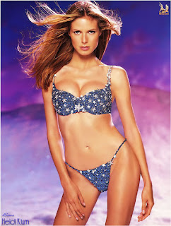
Noise, begone with ye!
When getting rid of noise, don’t forget to work on the background! Grainy, unretouched backgrounds make a scan look incomplete.
For this particular scan of Heidi Klum, I masked out the background, and floated it on a separate layer. I then applied a small guassian blur filter to smoothen out the grain, and then enhanced the saturation (through levels) of the background. It takes a little more effort but the overall result and effect is worth it. :)
Sharpness
Pretty much self-explanatory, and the final step of the retouch process. The scanning process, retouching and finally resampling the raw scan to the finished copy makes the scan soft and blurry. Careful sharpening can really bring out all the hidden details. There are chapters in Photoshop books dedicated to the application of the unsharp filter. Experiment and find out the technique you like best. Remember not to oversharpen! Just remember this…..an unsharpened scan is an incomplete scan, period.

How’s this for sharpness?
Though you can’t see it in this greatly reduced picture, but you can practically count the threads and see the weave pattern on Rebecca Tan's pink dress.
Never underestimate the power of sharpening to bring out the details!
The sharpening process in turn causes noise – so leave the sharpening as the very last step in your retouching process.
Some Tips On Retouching
If you’re truly serious about retouching, get a graphic tablet! A mouse is great for many things, but fine selection and drawing is not one of them. A basic graphic tablet shouldn’t cause an arm and leg. A good, basic one costs about S$150-200. No name brands from Taiwan can cost half (or more) of that price. I use Wacom, not because their tablets look cool (they do), but because it’s fast and responsive. They are excellent value for money. Nothing spoils your mood faster than by using a laggy (and cheap) tablet.
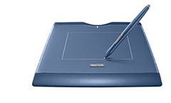
Get a tablet like the one here (which I’m also using) and see your productivity skyrocket! Masking and selection that used to be incredibly twitchy (not to mention frustating) using the mouse is now a cinch.
Now retouching is how it should be….fun, instead of tedium.
Tuesday, March 10, 2009
Chinese New Year!
Yeah, I know The Year of the Ox is over now for a couple of months, but whatever :)
I have been doing scans commemorating Chinese New Year for a number of years now. I guess you could call it somewhat of a dScans tradition :) Most folks seemed to like it, so I plan to keep doing it.
This is my very first CNY scan all the way back in 2002, featuring the delectable Denise Keller. Wow, 2002. It means I have been doing it for 7 years now. Time does fly doesn't it?
Here's the latest one released for CNY 2009, The Year of the Ox. Ann Kok is the model here, and what a beautiful gal she is. I have a soft spot for Ann, and it's a pity she's so under-rated as an actress. I just love those dimples!
And like they say, what's a post without some goodies? Here's 2 un-released scans from 2002. Since it was the first time I was doing it, I was experimenting with backgrounds, layout and whatnot. I'm glad to say it got a whole lot easier as the years went on :)
Vivian Hsu
This set was released a few days ago. You can get the scans from the archive here.
If anyone has discovered the secret of eternal youth, it surely must be this lovely lady. I still remember her very first photobook, and she didn't look as if she aged much since then. If anything she looks even more beautiful.
The last 2 pictures were double page spreads in the magazine. The pages were carefully torn from the magazine, scanned individually, and merged in photoshop. I decided to give myself a challenge and see how big an image I can get and still look good. Typically, magazine scans do not look good at larger sizes - at higher resolutions, artefacts like moire, grain or editing artefacts show up even more clearly. The last 2 images were almost 3,000 pixels wide before I decided it was getting ridiculous and I resampled them down to about 2,000 pixels wide.
I thought the results looked pretty good. What do you guys think? :)
Welcome!
Welcome to The Accidental Scannist, my very first blog! (So be gentle, dear readers :))
Here I will post my latest scan releases, together with comments about the subject matter and the techniques used to retouch the image. I currently release my scans via email through my Yahoo group (http://groups.yahoo.com/group/dscans) and my Google group (http://groups.google.com.group/dscans), and this is a little impersonal. I hope to use this blog as a means to interact with some of the folks that collect my scans. We'll see how it goes :)
Comments, are of course, most welcomed.
Subscribe to:
Posts (Atom)